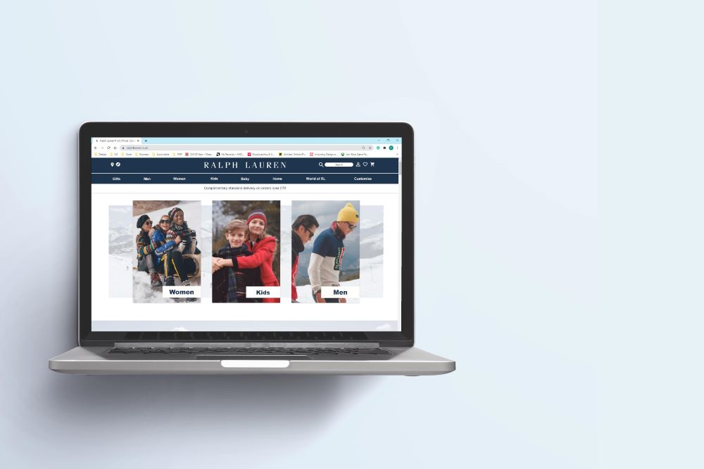
Ralph Lauren Corporation, a global leader of premium lifestyle products including apparel, accessories, home, fragrances, and hospitality.
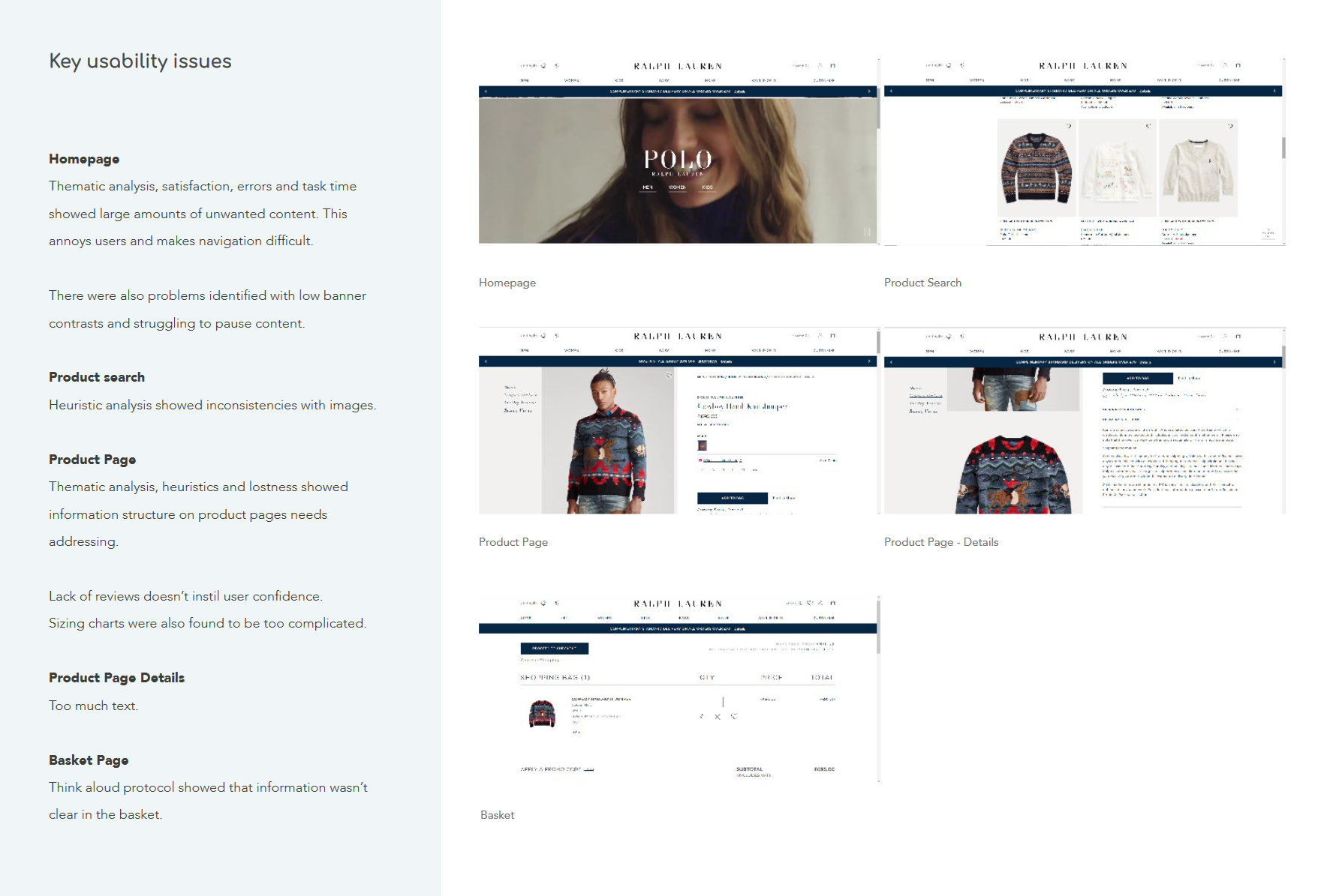
We conducted thematic, heuristic, satisfaction and performance related issues across the Ralph Lauren website. Issues were then catalogued to discover ways to make the site more intuitive and satisfying to navigate.
The main goal of the project, adding value to the Ralph Lauren website was particularly challenging. The company has a design team dedicated to improving sales and conversion rates. This meant that research and testing had to be highly user-focused to achieve a meaningful design outcome.
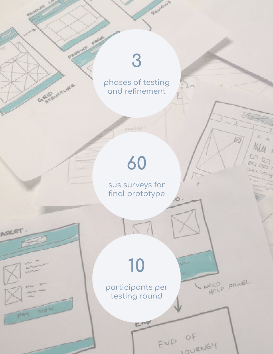
Testing showed that there was a statistically significant decrease in SUS scores between the original website (w1) (M= 82.1.6, SD= 9.674) to the redesign (w2) (M= 89.1 SD= 10.126), t (25) = 3.013, p < .05 (two tailed). The mean difference in SUS scores was 7.0 The eta squared statistic (0.275) indicated a large effect size. A power of .90 was achieved.
This means that the Ralph Lauren redesign is more ‘usable’ and satisfying than the original website.
We are 90% certain this answer is correct and unaffected by chance.
